“Traveling – it leaves you speechless, then turns you into a storyteller.” – Ibn Battuta.
We really can’t sum it up better than that. To travel, is to create your own adventure, your own story. You’ll never know what kinds of breathtaking landscapes and interesting characters you’ll run into. If you’ve travelled or want to start travelling, you can be sure that there will be a number of anxious people waiting to live those adventures vicariously through your blog.
The story is yours to tell, however, it’s all about how you tell it. Put yourself in your readers’ shoes, what would they like to read about? What kinds of stories will they want to hear? What’s the tone and theme of your story? It’s important to consider these factors for your travel blog, as it will likely have a significant impact on the overall success of your endeavor.
We are here to help guide you with some of the more technical aspects of getting your travel blog of the ground. Specifically, helping you to choose the right WordPress theme that’s in-line with your design style and meets your functional requirements. Here are some factors we’ve taken into account:
- Page load speed
- Ease of use
- Attractiveness of design
- Mobile responsiveness, and
- Extensiveness of functionality
To read more about each of these criteria and why we think these are the metrics that matter most, check out our article on how to choose a WordPress theme.
In compiling this article, we’ve analyzed hundreds of WordPress themes and summarized the 20 best travel blog WordPress themes available now. So without further ado, here they are.
The 20 Best WordPress themes for Travel Blogs
- Soledad WordPress Theme
- Newspaper WordPress Theme
- Voyager WordPress Theme
- Olsen WordPress Theme
- CheerUp WordPress Theme
- SimpleMag WordPress Theme
- The Voux WordPress Theme
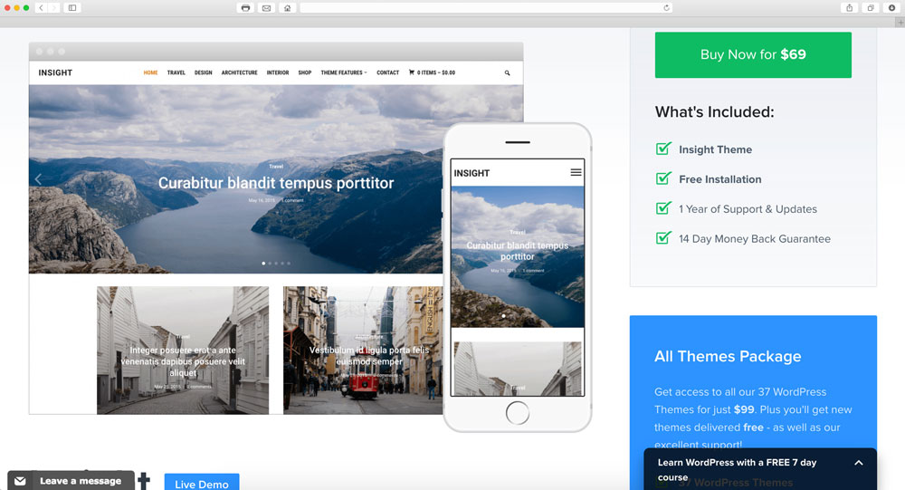
- Insight WordPress Theme
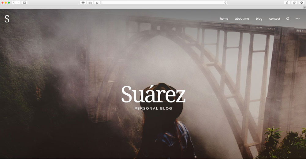
- Suarez WordPress Theme
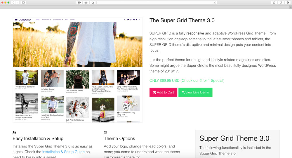
- Super Grid WordPress Theme
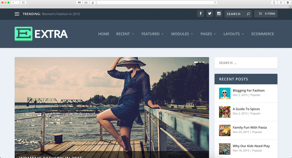
- Extra WordPress Theme
- Alder WordPress Theme
- Wayfarer WordPress Theme
- Sensational WordPress Theme
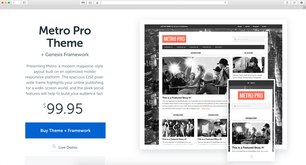
- Metro Pro WordPress Theme
- Divi WordPress Theme
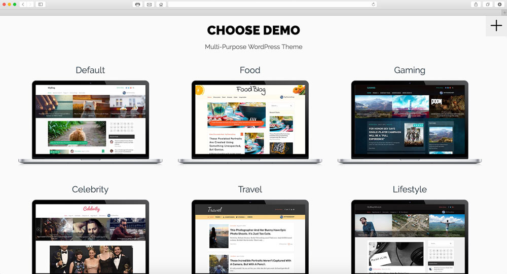
- MyBlog WordPress Theme
- Vogue WordPress Theme
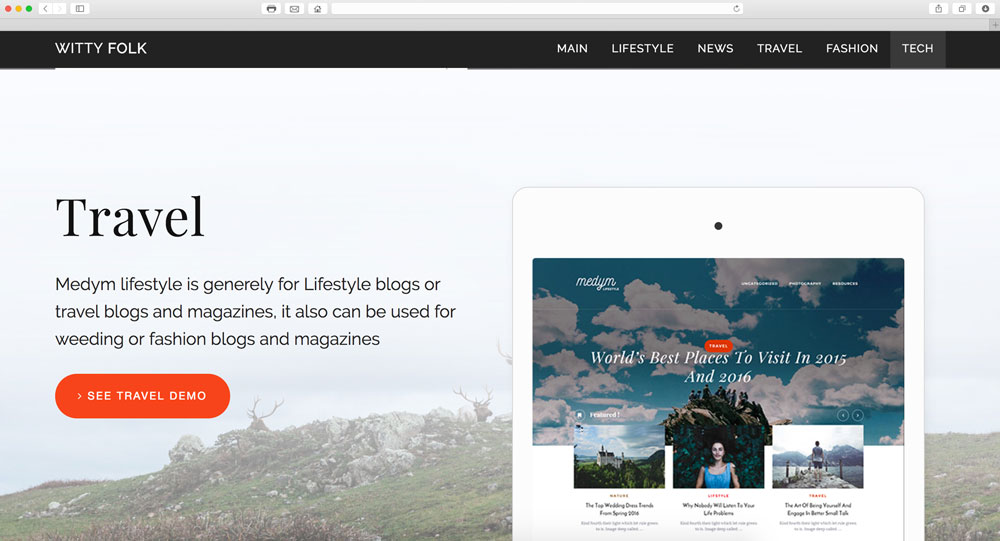
- Medym Travel WordPress Theme
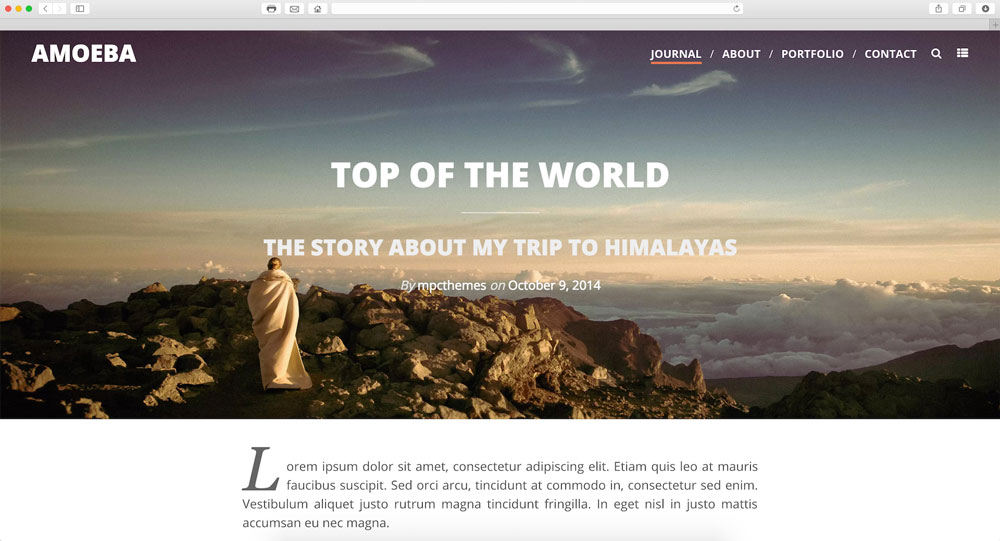
- Amoeba WordPress Theme
Top 3 WordPress travel blog theme reviews
Measuring the page load speed, ease of use, attractiveness of design, mobile responsiveness, and extensiveness of functionality, we have ranked the top 20 WordPress blog themes in order. Below are the themes that made the top 3.
Soledad WordPress Theme (9/10)
Soledad at a glance:
- Superb mega menu
- Modern design
- Deep and functional navigation
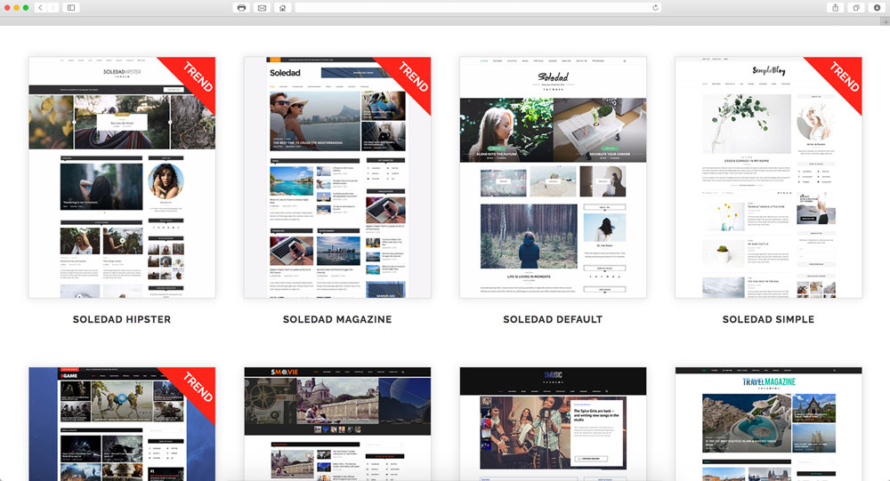
Once you get over the speed bump, Soledad treats you to one amazing travel blog experience. It has a very modern and polished design that feels as if the individual pieces were perfectly assembled into one highly attractive and intuitive layout. Although it lacks that one killer feature, everything else that the theme has is great.
Soledad page load (6/10)
This is the one department where this theme can definitely do with some improvement. The slow speed is mainly due to the number of images that are used, especially on the home pages. The developers have done everything necessary to trim script requests among others, but the sheer amount of content will get you no matter what. Google PageSpeed awarded Soledad with a 51 rating for mobile and 47 for desktop.
Soledad ease of use (10/10)
Soledad features deep and intuitive navigation. All posts have a breadcrumb bar so that you can navigate straight to the relevant subcategories. We also like that they replaced the customary image slider on the homepage, with something more like an “article slider”. Not only that, but it has one of the top 5 mega menus in this list. The categorizing of articles on the main page is also very helpful. Finally, most images have hover states and you have access to a great gallery feature.
Soledad design (10/10)
One thing we like about Soledad is its modern design. You would think that all sans-serif fonts will be boring but think again. It comes across sleek and laid back – The color contrast between black and turquoise is also soothing and reminds us of blue skies and the ocean (both things we associate with travel). A slight letdown is the small text size in articles, but that is really the only negative. While being very busy in general, the wise use of padding and alignment keeps it from feeling cluttered.
Soledad mobile responsiveness (9/10)
The mobile experience is just as good. The black divisions that separate categories help break up the page and makes it easier to follow where the user is exactly. Everything else works as expected and there are no alignment or sizing issues. The image slider can have multiple rows of articles, which is a nice option to have.
Soledad functionality (9/10)
Soledad just needs that one distinguishing feature to give it a 10/10. E-commerce is supported via Woocommerce, which is always a big plus. Other than that, there are a ton of widgets and layout variations to enjoy. It gets extra points overall because the blog feels tailor made, which we can appreciate.
Newspaper WordPress Theme (9/10)
Newspaper theme at a glance:
- Extremely easy to use
- Superb mega menu
- Neat, legible fonts
Simple at first glance, Newspaper delivers everything you could wish for in a travel blog. It gets a special shout-out for its big and easy to read fonts. The mobile experience is great and the best thing about this theme is that it manages to keep all of its features without having it feel too cluttered. The cherry on top is that this theme includes niche specific widgets allowing you to create a truly customized experience.
Newspaper page load (7/10)
This is quite an impressive page load speed for a site with this much content, widgets and media. On mobile it scored a 62 from Google PageSpeed which isn’t bad at all – Desktop, however, did a little worse and scored a 54. Script requests, DNS lookups and redirects are kept to a minimum – It could be improved by combining external JavaScript and CSS.
Newspaper ease of use (9/10)
Despite all the content, Newspaper remains ridiculously easy to use. The only factor that made us deduct some points for the theme’s ease of us is that not all images would benefit from having hover states. What’s nice however, is that every single image in article pages opens in a lightbox (something that is often neglected by other themes). The theme’s extensive mega menu takes a little time to load but the theme makes great use of its breadcrumb, which makes it more convenient.
Newspaper design (9/10)
This is another theme that uses black, white and turquoise well – It really gives an outdoor feel (which is perfect for a travel blog). The theme deserves a shout out for its easy to read fonts (in fact, it’s the easiest font to read out of all the themes on this list). Though the theme looks simple at first glance, there is a certain charm to its simplicity that most will appreciate.
Newspaper mobile responsiveness (10/10)
Newspaper’s mobile responsiveness scored a perfect 10/10. It’s one of those rare themes on our journey that even beats the desktop version. As you could see earlier, mobile also has a faster page load speed that contributed to its overall score. It has a nice, full-screen menu so that the links are big and easy to click. The layout feels cleaner and more organized and the images even open in Jetpack!
Newspaper functionality (10/10)
The stand out widget for Newspaper that gave it a perfect score is the weather widget (which is something that is very unique on this list). This feature is only one among many as the theme offers a wide range of other custom widgets (this includes Instagram and Exchange) as well as integrations such as bbPress Forum, BuddyPress, and most importantly Woocommerce.
Voyager WordPress Theme (9/10)
Voyager theme at a glance:
- Stand out ‘Map’ feature
- Unique designs
- Nice animations
Voyage into the waters of travel blogging with this awesome theme. The Voyager takes a lot of its queues from the previous two themes. It has all the features, layouts, and widgets you would expect from a travel blog, plus a unique map with regional links! Nifty! As you can see from the scores, Voyager makes up for its slow page load speed by scoring high in all other categories.
Voyager page load (6/10)
The main reason that Voyager came in third overall is its slow page load speed. Unfortunately, the theme can’t use the excuse that it’s heavy on features, widgets and content – With a rating of 33 on mobile and 37 on desktop from Google PageSpeed, it unfortunately isn’t good enough.
Voyager ease of use (9/10)
This theme does a good job of remaining easy to use even though it has some unique characteristics. We like the zig-zag way in which posts are listed on the main pages’ default design. The main menu is the only one in the top 3 that doesn’t have a mega menu, but its own menu is easy to use and its also nice to look at. The navigation is pretty straightforward and you won’t easily get lost.
Voyager design (9/10)
As we just mentioned, the design for Voyager is interesting in its break from the mainstream. If any of them are not for you, there are more than enough variations for you to choose from (some of which are more traditional). The fonts used are also modern, sans-serif and very readable – The text is slightly thin, which means it’s not quite as good as the font that came with the Newspaper theme. The whole theme also comes alive through countless amounts of small animations.
Voyager mobile responsiveness (9/10)
Voyager transforms beautifully to mobile – It finds a way to keep all of its distinguishing features even though it has to fit a smaller screen.The menu expands from nothing into an interesting twist. The only two slight complaints we have is with the slow page loading speed, but this is the same for desktop and that on some parts of the main page padding is inconsistent.
Voyager functionality (10/10)
Besides having all the usual features like e-commerce (thanks again, Woocommerce), travel specific layouts and design, and almost all the widgets you could want, it comes with another special one which makes it extremely unique. Voyager comes with a world map, with different regions being able to link to their respective categories! We almost can’t believe more themes don’t have it – It’s truly the perfect addition to a travel blog.
Additional travel blog WordPress theme reviews
Below are the WordPress travel blog themes that made the top 20, but didn’t quite make the illustrious top 3.
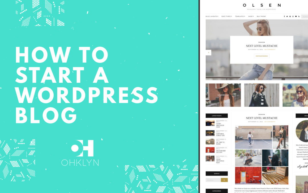
How to start a blog – step by step guide
Want to start a travel blog? Then check out our guide on how to start a blog where we go through how to set up a WordPress blog. We use bluehost as our hosting provider, and as part of the OHKLYN community, you get access to discount hosting.

